Walleta
ENG-SCI 22 Design Survivor: Experiential Lessons in Designing for Desirability
Design Prompt: To design a product that encourages millennials to save money
Timeline: 1 week
Collaborator: Shasha Du
Problems at Hand:
Use of non-cash currency such as credit card, Apple Pay, and PayPal mentally distances the user from their financial budget
Each expense is seen individually and not viewed as part of a larger purchasing trend. Habitual expenditures such as coffee and take outs are harder to register the ordering frequency
Lack of immediate reminder of how a purchase affects overall balance. Calculations needed to be done manually, or via self checking of bank accounts
Due to lack of information/ financial literacy, some users are unsure of how much to save and what a realistic disposable income is
Targeted Approach:
Walleta is an automated expense and budget tracking smartphone app primarily designed for 20s - 30s crowd. This group of individuals has the most potential to save but also tends to spend impulsively and is less financially literate. We seek to make spending more conscious and purposeful.
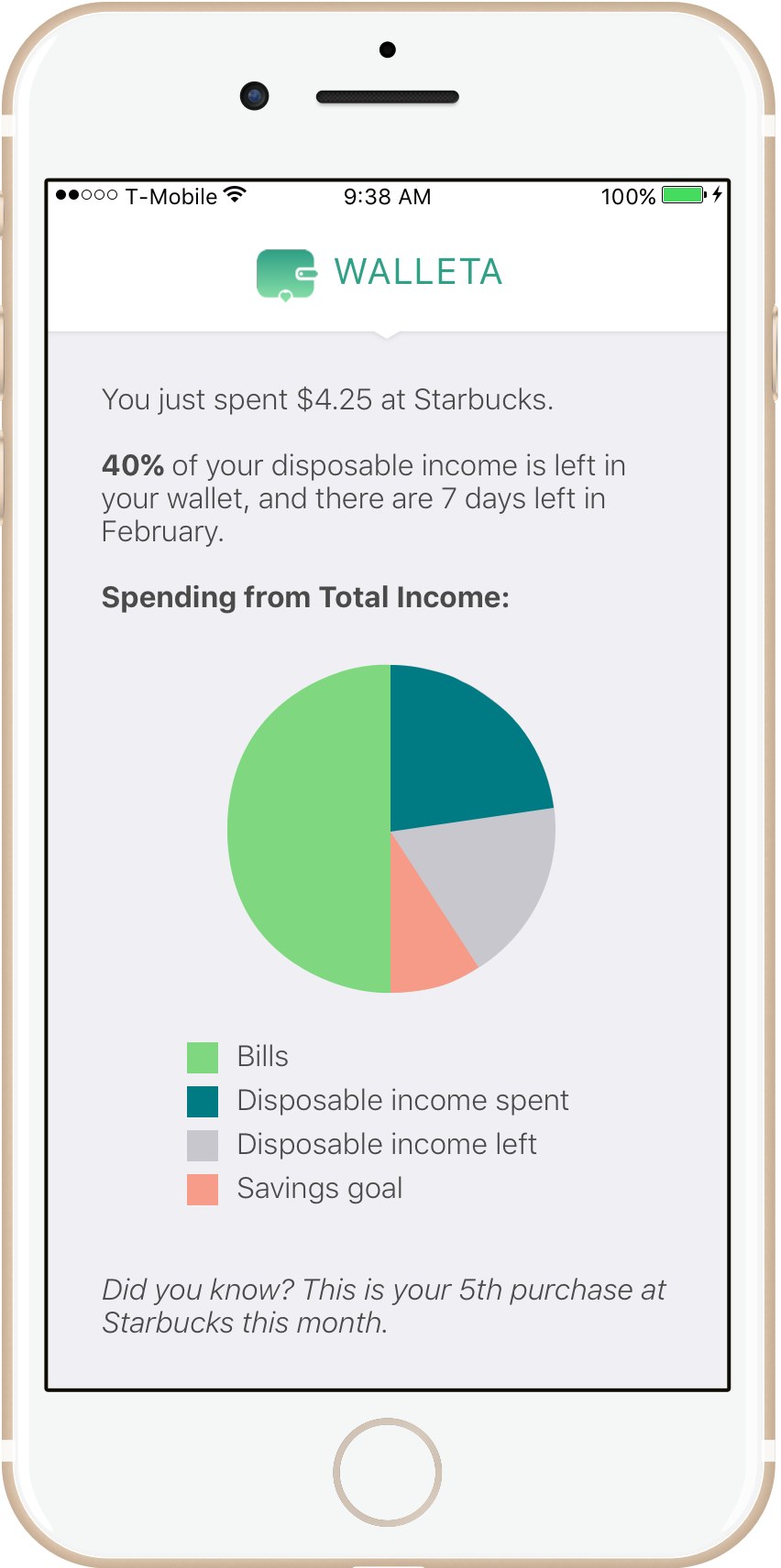
Users can view more details about their spendings in the app. Note that users can view further details and analyses on itemized spending by tapping on the “disposable income spent” part of the pie chart (in dark green).
Walleta aims to make awareness of spending habits as easy as possible through its simple user interface.
The Setup:
Walleta collects data on the user's monthly income and bills from their checkings, savings, and credit accounts, and calculates the monthly disposable income. Walleta automatically separates monthly recurring bills into major categories, but users can also enter additional bills and adjust automated metrics, allowing for personalization. On the next screen, Walleta provides guidance for the user to establish a monthly savings goal based on trends among the user's age group.
Notifications:
Walleta is linked to the user's credit accounts so that every time a purchase is made, a notification pops up and informs the charge amount, remaining monthly disposable income, and any spending trend. Notification messages appear in two colors: green indicates being on track to meet savings goal, while red indicates not being on track to meet savings goal.
Walleta Set-Up
Walleta Notification Screens
Future Explorations:
We received feedback that a notification every time a purchase is made may become a nuisance. It would be interesting to think of more user friendly ways to notify spending habits.
Walleta could further incentivize saving by partnering with banks and rewarding users every time a saving goal is met.
Walleta could complete automatic transfer of the user's savings goal into a savings account each month.


